

Font choice is a decision that has to be made for every design. Whether it's a flyer, website, and especially signage, the font that is used can be the difference between a successful design and one that gets overlooked. When it comes to custom company signage, font choice is especially important for exterior signs. Interior signs are typically viewed up close which allows for more flexibility. Exterior signs are viewed from further away, where things such as font style, weight, case, and content are all of importance.
Font Style
There are thousands of different fonts to choose from and more are created everyday! With this many options to choose from, how can you ever make a decision? Well, it's easiest to break it down into four categories. From there you can determine what will be best for you.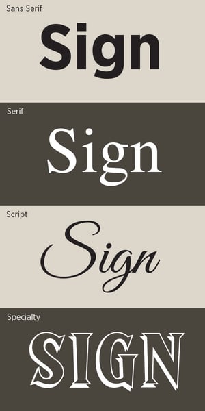
- Sans-serif is a style most used when few words are needed. They don't have the projections coming from the upper and lower portions of the letters which makes them clean looking and easy to read. When an exterior sign is required to be read from a long distance, a sans-serif font is always recommended. This style is especially great for LED illuminated letters. The block style easily allows LEDs to be installed in the letters. Helvetica, Arial, and Myriad are probably the most commonly used versions of sans-serif fonts.
- Serifs are the little projections at the tops and bottoms of letters. This style of letter is great for larger bodies of copy that are smaller in size. The eye is able to distinguish characters with serifs more quickly when compared with sans-serif and script style fonts, making them easier to read. These won't be used as much for LED illuminated letters because the serifs can be too narrow for the LEDs. We suggest using a bold version of the font or changing to a block style when this is an issue. Times New Roman, Garamond, and Goudy are a few of the more popular fonts in this style.
- Script and Cursive styles are designed to mimic handwriting and are typically more classy looking than the other styles. These are usually used for more formal looking designs such as invitations or event materials. They don't work well for signage because fabricating them can be tricky and lead to increased costs. They can also be very difficult to read, which defeats the purpose of a sign. If this style is required, some modifications are usually needed in order to make the signage successful.
- Specialty style fonts can look great if used under the correct circumstances. This style is usually only used for a couple of words or a headline like 'Merry Christmas' or 'Happy Fourth of July.' These are usually very custom and can be anything you can imagine. Typically specialty fonts are reserved for special occasions or holidays, which means they aren't great for permanent signage, and very rarely will you see it as an LED illuminated letter set or something that is meant to be up long term.
Font Weight
Bold fonts typically lead to a more successful exterior sign. The extra weight of a bolder font leads to more contrast with the background. However, too bold of letters can have the opposite effect as they tend to run together. Your sign company should be able to provide you with a rendering showing the proposed location of your sign. This will help give you a visual which will help you decide if what you have is too bold or needs more weight.
Font Case
A combination of upper and lower case letters is the easiest to read. Upper and lower case is best used for directional signs or signage that contains more content. You want this type of sign to have characters that can be quickly recognized since people are often driving, and you want this information to be easily absorbed.
We recommend using all upper case for headline style signs such as 'EMERGENCY' because it has a bit more impact and really stands out.
Content
As we've mentioned briefly above, the amount of content you are using can help determine which font(s) should be used. If you're showing a business name with a tagline it can be helpful to have a mixture of two font styles. For example, a bolder block style for the business name with a serif style tagline can enhance a sign and make it more visually interesting as compared to something that is in all the same style.
This information is intended to help be a guide for what has proven to work for other companies. But this is by no means an end-all be-all for signage. You should truly go with what you believe represents your company. And if you're uncertain, give us a call and we'd be more than happy to have a discussion with you!

 "http://cdn2.hubspot.net/hubfs/545157/assets/images/patrick-woller-spectrum-signs-square.jpg"
