
Custom signage gives you the opportunity to have freedom in design, placement and content. This is a great thing, because you're able to build the sign to fit around your brand specifications. With all this freedom it's important to remember you still want your sign to be effective. Here is a list of common mistakes that can be easily remedied if discussed on the front-end of a project.
Overdesign
Having a great design is something everyone strives for in their signage. But taking the custom sign design too far can actually be more of a problem than not taking it far enough. An overdesigned sign can often leave a sign looking unplanned, confusing and usually just plain messy. Knowing where to find a balance of different colors, accents and even font choices can be the difference between a sign that highlights your brand or one that misses the mark. Here are some contemporary color combinations that could help separate your sign from others.
Font Choice 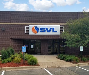
I know we say it all the time, but font choice is absolutely one of the most important characteristics of a sign. Stay away from fonts with thin strokes, serifs and script style letters because they will never make an impact on the side of a building. They often get lost because there just isn't enough substance to stand out. Bolder block style letters tend to provide enough contrast to read from long distances.
Placement
Sometimes there isn't a choice on where to place a sign. Leases, sign criteria and city requirements can often make the decision for you. But if you do have options on placement, make sure you avoid trees, buildings and other sight line obstructions to maximize the potential for you sign. It might sound obvious, but surprisingly it happens. Driving past the sign location can give you different vantage points and help identify possible obstacles. If a sign needs to be read from farther away, remember that for every 1" of copy height, you will get about 25'-0" of viewing distance.
Too Much Information

Putting phone numbers and website addresses on exterior signage should be a thing of the past. But, they are still found on signs all over the place. That information takes up valuable space that could be used to increase the size of your logo or company name. Motorists won't remember a phone number or website address when driving past. If that information is needed, an option is to install door or window vinyl at the main entrance of your building.
All of these can be very easy issues to correct. Sometimes it's as easy as adding a little thickness to a font or tweaking a color. Here at Spectrum Signs we supply you with full color renderings so you can see exactly what your custom signage will look like on the building, so there are no questions.
Contact us today regarding your custom sign project!

 "http://cdn2.hubspot.net/hubfs/545157/assets/images/patrick-woller-spectrum-signs-square.jpg"
