

Depending on your location, customers could be driving by at high speeds, which means you only have a few seconds to grab their attention with your signage. The easier it is to see and read your sign from a distance, the longer your prospective customers have to view it, process it, and take action to stop in for a visit.
That’s all to say that your business signs have to be effective to get noticed, especially since road signs, obstructions and the surrounding landscape all compete for a driver's attention. The size and scale, locations, color, font, images, and materials you choose all impact how effective your signage is.
Business Sign Design Aspects to Keep in Mind
Size and Scale
Experts recommend that business sign designs incorporate letters at least one inch tall for every 25 feet of viewing distance in order to be legible for all legal drivers. For example, if a sign is viewed from 410 feet away, the minimum height of each letter should be 16.4 inches for a car traveling 30 mph.
In order to maximize the impact, signs have to be seen from a distance, often by people who are looking in that direction just a few moments. This distance guide from the International Sign Association will give you a better idea of how this works:
| Minimum Required Legibility Distances in Varying Situations | ||
| Speed (MPH) |
With lane change (in feet) |
Without lane change (in feet) |
| 25-30 | 410 | 155 |
| 35-40 | 550 | 185 |
| 45-50 | 680 | 220 |
| 55-60 | 720 | 265 |
| >65 | 720 | 280 |
 Location
Business sign design incorporates much more than making the sign look good. Placement, size, lighting, and other factors should meet the needs of the building location. Consider the background color of the building facade, as well as the color scheme of surrounding structures, buildings and landscaping. Your sign color palette has to stand out without clashing with its surroundings.
Another aspect of location impacting your sign is the regulations and ordinances that govern signage in your area. This can impact your message, words, images and colors, so make sure you understand the rules before spending a dime.
Color
If you already have a color scheme that's used in other branding, you're sign should use those colors or at least blend in with them. Some businesses use colors that don't adhere to the latest recommendations for how color affects mood and willingness to purchase. If that's the case for your company, consider hiring a brand consultant to help you choose a new color scheme that also works for your business sign design.
You want your brand colors to pop when a customer is searching for your business, even if they aren't close enough to read the sign. In some cases, such as for doctor's offices or medical facilities, this may literally be a matter of life or death.
Font
Keep it simple. Your sign needs to include the company logo, but other than that, choose a simple, easy-to-read font. Opt for straight edges with no curling (sans serif) and consistent height. The stroke width is important because wider strokes are visible from further away. If you're also rebranding a text logo, keep these rules in mind so that your signage and print branding can be coordinated.
Images and Graphics
The best business sign designs use a combination of elements that make them most readable and safe for viewers. Choosing a single element to dominant the sign is a way to catch the viewers attention, and the accompanying graphics are just the beginning of the sales process, so there's no need to squeeze in every last detail about your business.
Contrast
Beyond just the important link between your brand and color scheme, contrast plays an important role in how viewers perceive your sign within its environment. Bright, lively colors attract new customers to seek out your store. A strong border can focus viewers' attention to your signage as well and make it stand out from the surrounding environment.
Materials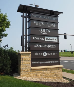
When you select the material for your sign, don't consider cost alone. Hopefully, this is a one-time purchase, so you need to consider the long-term impact of the money you put into it. To begin with, pick a material that is colorfast and durable, so it lasts a long time and continues to look great. Even though you want to stand out, remember that viewers have certain expectations when it comes to what different types of signs are made of. If you veer too far off the beaten path, your signage might not even be noticed.
If you have questions about business sign designs that would work for your business, find an expert to help you navigate the intricate world on fonts, graphics and viewer expectations.

 "http://cdn2.hubspot.net/hubfs/545157/assets/images/patrick-woller-spectrum-signs-square.jpg"
