
1. Lack of color contrast.
Many people are so focused on the sign itself that they forget to take into account the background that the sign will be placed on. Without contrast, a sign will be difficult to see.
Light colored letters on a light background or dark letters on a dark background are very difficult to see. There isn’t enough difference to make the sign stand out from the background so it blends in. I’ve seen signs that aren’t even visible because they are the same color as the background.
It’s important to think carefully about color choice so that your sign stands out. We can help you pick the best colors.
Top 10 Sign Mistakes
See what mistakes to avoid to make sure your sign has the most impact!
Find out now!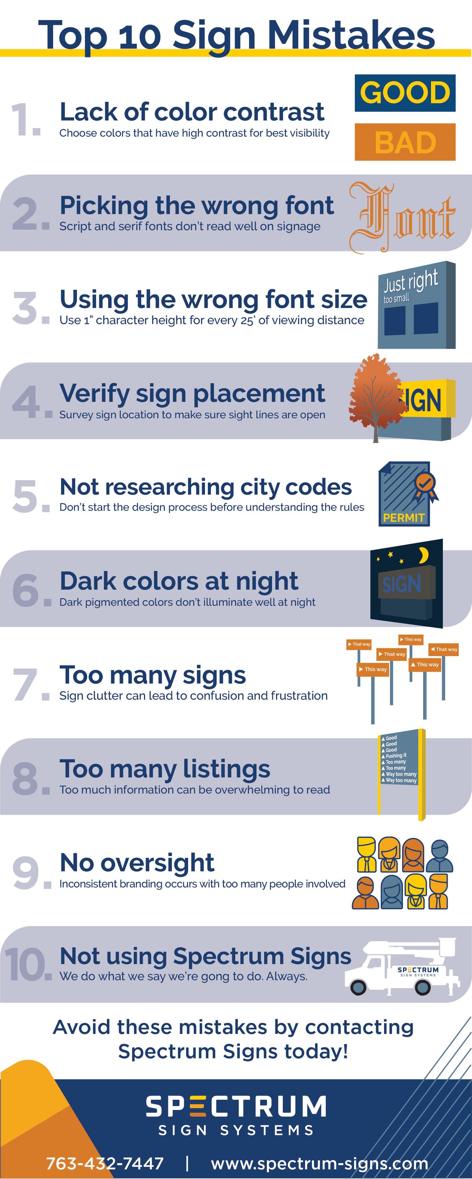
2. Using the wrong font.
Font choice is one of the most important decisions to make when designing a sign because many fonts are difficult to read. A cursive font is very difficult to read because the letters are joined together and curvy. The lack of separation makes the letters run together making it very difficult to read, especially from a distance. Some fonts are too thin or too fat to read.
Your brand guidelines may call for a font that doesn’t work on a sign. We have experience with this and can guide you to the best solution. We will provide you with mock ups of design options so you can pick a design that works within your brand parameters.
We have 20+ years of experience and we’ll help you pick the best fonts for your sign needs.
3. Copy height too small.
Have you driven by a sign or billboard and thought, “I can’t read it. What a waste of money?”
Choosing a font that is too small to read up high, at a distance or at high speeds, is one of the biggest sign mistakes people make.
Font size needs to be maximized. When considering font size, every 1-inch of character height can be read from 25 feet away. If your sign is 100 feet away, the letters need 4 inches high at a minimum.
4. Putting the Sign in the Wrong Place.
Sign placement is the key to the success of your sign. Is it too far from the road? Is it too low to the ground where no one can see it? Are there things blocking it?
Placing a sign too far away from the road makes it difficult to read or easy to miss.
If you're trying to attract people driving by, you’ll need height.
Another mistake I see people make is not considering the landscaping around the sign. Will that small tree grow to cover up your sign in the future?
A site survey can identify the best spot to place your sign. We will take into account city code, utilities, traffic patterns and the best sight lines so your sign will be seen.
5. Not researching city codes before starting the design process
Finding out what city codes are when you are ready to put the sign up is too late. You need to research city codes in your area at the beginning of the process so you know what your parameters are.
Many cities have codes covering the size, amount of signs allowed, square footage allowed, colors that can be used, lighting restrictions and so on.
Trying to figure out the various rules and regulations and the documents you need to submit for permitting can be an arduous, time consuming task. And these rules and regulations differ from city to city.
What works in one city may not work in another. Failing to follow the rules and regulations may result in fines, delays or denial.
We have dedicated staff that can help you navigate the complex world for city permitting. Learn more about city codes.
6. Picking the wrong colors
Color choice is very important when designing a sign. Certain colors are easier to read or see from a distance. Other colors don’t work well if the sign is lighted.
The pigment in dark blues and purples make them difficult to read when lit up at night. One solution is to use a white trim around the dark colors. This allows you to use the dark colors you want and make them stand out at night when lighted.
7. Too many signs
Having lots of signs isn’t better. Sign clutter can lead to confusion and frustration. You want to use the least amount of signs to accomplish your goals.
If you're concerned you have too many signs or you have a wayfinding problem, and not sure how many signs you need, we can help.
We will conduct a site survey that will map out traffic flows, identify key decision-making points, and identify potential problems. We’ll take the information from the site survey and combine it with city code to help you create a wayfinding plan that minimizes your customers frustration and saves you money by using the least amount of signs.
8. Too many listings on a sign
Having too much information on a sign is overwhelming for the reader. This is especially true for outdoor signs when people are driving. They only have so much time to process the sign before they need to move on so they aren’t blocking traffic.
And the more words, the smaller the font size will need to be to get everything to fit.
We recommend no more than 3 - 4 listings on a directional sign.
Interior signs can have more listings because people are walking and have more time to process information. However, you should still keep things to a minimum. Can you say that in less words and still get the point across?
9. Not having a designated person in charge of signs
Having multiple decision makers leads to inconsistency and an erosion of the company’s brand guidelines
This is particularly a problem if your locations are far apart. It may seem convenient to have someone at each location be in charge, but without oversight and a company sign policy, signs will go up that aren’t needed and don’t meet the branding guidelines.
We’ve helped customers conduct brand audits. We found that every location looked completely different. Brand guidelines were loosely followed because each manager had their own idea of what the sign should look like. The number of signs also varied at each location.
Having one designated person or a committee that has the branding guidelines and a company sign policy, will lead to the consistent implementation of your brand at all locations.
10. Not working with Spectrum Sign Systems
We’ve been in business for 20+ years. We know all the pitfalls and will steer you clear of them so you can make the most of your signs.
Connect with one of our sign experts today to make sure your sign project doesn't end up on this list.

 "http://cdn2.hubspot.net/hubfs/545157/assets/images/patrick-woller-spectrum-signs-square.jpg"
