

A custom sign should be an important part of your marketing strategy. Not only does a sign differentiate your business from those around it, it can also attract new customers, or serve as a landmark so customers know how to get to your business.
On the other hand, a poor sign can also affect your business. Think about if your sign was misspelled, unreadable or just plain ugly. Would you, as a customer, be inclined to use that business? Probably not.
When creating your sign, it’s important to think about the type of sign you want, but also the color scheme. If your color scheme is unreadable, or doesn’t represent your brand well, your customer will get lost (figuratively and literally!), when trying to locate you.
When creating your next custom sign, keep these color tips in mind:
Colors Evoke Emotion
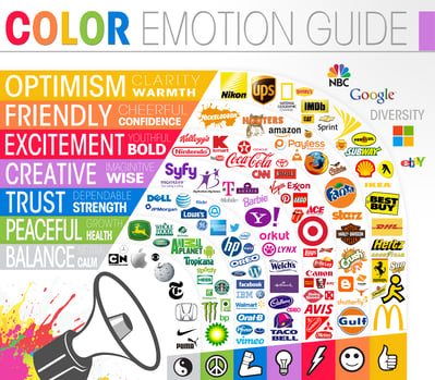
Did you know there’s a science behind colors? Colors subconsciously evoke emotions from people.
This graphic from The Logo Company describes the emotions that are subconsciously associated with each color. Depending on what you’re selling, or what the purpose of your sign is, it’s important to keep this in mind.
When choosing a color for a logo or sign, stay on brand and think about what the color is saying to your customers, patients or visitors.
Colors Align Your Brand
Chances are, you already have colors associated with your brand. When creating a custom sign, you’re going to leverage these colors in order to create brand recognition.
This is especially important when your sign’s purpose is landmarking. Your brand colors will pop out when your customer or patient is looking for your business, even if they’re too far away to read the sign. Especially if you work at a hospital or clinic and people who are looking for you may be in distress.
Colors Show School Pride
If your custom signs are for a school or university, it’s a great way to show off school pride. Using school colors on signs throughout the university creates a cohesive brand. Signage that supports your brand and looks put together can also make a good first impression to potential students on tours.
Colors Support Readability
The colors you use on your sign need to support readability. Because many people will see your sign from afar, the text color you choose needs to work on the background you choose. Putting yellow text on a white background, for instance, will make it hard for a passerby to read clearly. Instead, think about using a light background with dark text or vise versa. The ROI of your sign goes down significantly if no one can read it!
Colors Catch Attention
Bright, lively colors attract new customers into your store. Your color scheme can also communicate the feeling of your brand, and will attract people who are a good fit for your business.
When building a custom sign, think about what it says to passersby. Strongly consider which colors should be used in your sign, because it can greatly affect the ROI.
The design experts at Spectrum have 60 years of combined experience. They know which colors and designs will work for a sign, and which ones won’t. Schedule a time to discuss how our experts can turn your vision into a reality that will get results.

 "http://cdn2.hubspot.net/hubfs/545157/assets/images/patrick-woller-spectrum-signs-square.jpg"
